Freelancer: nadineudugama
Compartilhar:
Denunciar Inscrição

#18

Hi! Here's my submission. It's a combination of Black & White images (PPT filter), geometric patterns and typography. I've kept it as clean and professional as possible. I would suggest reducing the amount of text in the 'typical text'slide. It's generally considered good practice to have less text per slide so that it is easier for the viewer to focus and retain information. I look forward to hearing your thoughts!
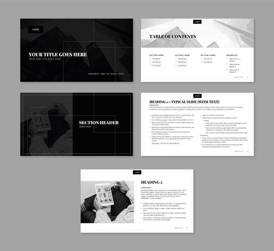
Inscrição nº 18 do Concurso para                                                 Slide Template Design - For Professional Powerpoint Presentation
Inscrição nº18

Painel de Comentários

  • Asianexperts
    Asianexperts
    • 4 anos atrás

    Congrats Nadine, Proud to be a Sri Lankan

    • 4 anos atrás
  • sweetheartbarbie
    Proprietário do Concurso
    • 4 anos atrás

    Thank you for the suggestions on Typical slide to reduce the text. I agree, but i also wanted to 'crowd' this slide to see if people could simplify. I use these presentations as 'reports', so unfortunately I need a lot of content on the slides as I am often not there to present them in person. But I also think they are better in Powerpoint than word.

    • 4 anos atrás
  • sweetheartbarbie
    Proprietário do Concurso
    • 4 anos atrás

    Hi Nadine, thank you for the submission, and the clever design layout ideas. I like the idea to split the "Heading 1 Typical Slide" page into 2 columns, and the black/white/grey them.

    • 4 anos atrás