Logo Design for The Thought Provokers
- Status: Closed
- Prêmio: $490
- Inscrições Recebidas: 7
- Vencedor: freelancework89
Painel de Comentários
-

transitionsweb
- 12 anos atrás
Yes, How unfair, 207 entries were made on this, and it is only fair to show the logo you all chose, so you can help everyone else know and understand what you were looking for all along...
- 12 anos atrás
-

spontaneous
- 12 anos atrás
Can we see winning logo? i am curious to know what contest holder was looking for!!!!!!
- 12 anos atrás
-

SXGinLA
- 12 anos atrás
Yeah I agree. I'm just starting out and would like to know what other people are looking for.
- 12 anos atrás
-
SXGinLA
- 12 anos atrás
I got an email saying they had picked a winner and to click a link to see the winning design. I clicked and it brought me here, I don't see the winning design though. I see the word pending at the top of the page. Is there some discrepancy over the winning design? (Mine is design #11 by the way. Just in case :P )
- 12 anos atrás
-
transitionsweb
- 12 anos atrás
I'm just disgusted at it all....
- 12 anos atrás
-
LuckyDenis
- 12 anos atrás
Well, that's the pain of Freelance logo Contests, neither you or the employer get a great service.
- 12 anos atrás
-

NguyenMinhNhut
- 12 anos atrás
Yes, my designs might be not enough to reflect the thought arousal and deep learning. Thanks for the contest.
- 12 anos atrás
-
spontaneous
- 12 anos atrás
all my entires got rejected, care to explain if i did wrong actually :)
- 12 anos atrás
-
transitionsweb
- 12 anos atrás
Yes, I got rejected, I think it was because I thought the name of their business was Thought Provokers...and they wanted a generic business management log...I don't know, they haven't told me either...
- 12 anos atrás
-
NguyenMinhNhut
- 12 anos atrás
Hi, thanks for the contest !
- 12 anos atrás
-

NXSOL PRIVATE LIMITED
- 12 anos atrás
plz provide feedback for #199
- 12 anos atrás
-
NguyenMinhNhut
- 12 anos atrás
Hi, #193 is just another style of #191, thanks.
- 12 anos atrás
-
spontaneous
- 12 anos atrás
is it the thought or only thought!
- 12 anos atrás
-
spontaneous
- 12 anos atrás
do check #189 and #192
- 12 anos atrás
-

hidex3
- 12 anos atrás
#184 will work perfectly in Web and in print.
- 12 anos atrás
-
NguyenMinhNhut
- 12 anos atrás
I'm sorry for the color fault, I'm going to submit new designs asap.
- 12 anos atrás
-
spontaneous
- 12 anos atrás
check #180
- 12 anos atrás
-
NguyenMinhNhut
- 12 anos atrás
Hi, #177 is my new version, thanks.
- 12 anos atrás
-
spontaneous
- 12 anos atrás
check #174 that is thoughtful and professional at same time. let me know. thanks
- 12 anos atrás
-

Developas
- 12 anos atrás
#173 Explaining the professional look by Tie and Fun to work by Piano and still deep thoughts involve............Best of Luck
- 12 anos atrás
-
NguyenMinhNhut
- 12 anos atrás
Hi, #165 is my first version, thanks.
- 12 anos atrás
-

slovetest
- 12 anos atrás
Hi contest holder, please view "The Private Message Board" for explanation. Thanks and regards SloveT
- 12 anos atrás
-

kcdesign0o
- 12 anos atrás
I was curious as to the colour limits, would that include the use of outlines in black or white. To clarify, if I use a white background and black to outline the logo portion and as the font colour would that leave me 2 hues off the pallet for the logo colours within the outline?
- 12 anos atrás
-
transitionsweb
- 12 anos atrás
Thank you for the opportunity to make a logo for you, I do hope I captured the appearance you are looking for and hope you consider me.
It was very thought provoking... :-)- 12 anos atrás
-
transitionsweb
- 12 anos atrás
Mine was rejected wit no explanation, some feedback to help me know if I was on track or not...I thought it was very nice..Thanks
- 12 anos atrás
-

rahulvyas12
- 12 anos atrás
Please See #103 #104
- 12 anos atrás
-

zulfibd08
- 12 anos atrás
@CH : For explanations of my entries #96, #98 and #101 please see "the Private Message Board"
- 12 anos atrás
-

prashant2024
- 12 anos atrás
Hi, Any feedback/comment on #93 will be appreciated.
- 12 anos atrás
-

eeshu
- 12 anos atrás
Waqasalikazmi , this is a contest not a project that you bid on......
- 12 anos atrás
-
rahulvyas12
- 12 anos atrás
lol
- 12 anos atrás
-

freelancework89
- 12 anos atrás
my one #58 .......feedback would be nice .thank you.
- 12 anos atrás
-

DivineIguana
- 12 anos atrás
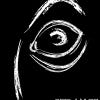
#53-56. The form of the human head is meant to evoke thoughts of vintage medical illustration, particularly phrenological charts that analyzed the human mind. The spiral shapes are playful and contemporary while also mimicking the shape of the human brain, The overall intent is to bring to mind both serious study and the notion of swirling thoughts and brainstorming.
- 12 anos atrás
-

AnshulSharma09
- 12 anos atrás
Hi.
See #52
Rate It Please- 12 anos atrás
-

Albarakah
- 12 anos atrás
hello:
please have a look at logo #44 elaboration #51.
regards- 12 anos atrás
-
GaryHennink
- 12 anos atrás
#35 the 2 circles in the middle (of the 4 on the outside) are the same size; it's an optical illusion and quite thought provoking! #36 & #37 use a cartoon bubble indicating someone's thoughts...
- 12 anos atrás
-

Waqasalikazmi
- 12 anos atrás
i have required for this project 5 days.
- 12 anos atrás
-

sebastianpothe
- 12 anos atrás
work based on synapse
- 12 anos atrás
-
Waqasalikazmi
- 12 anos atrás
i Have Ready Every time face the any task.
- 12 anos atrás
-
Waqasalikazmi
- 12 anos atrás
I have working on this project just $450 & complete this in 5 days.
Thanks.- 12 anos atrás
-
logodoc
- 12 anos atrás
Please check #32 .
- 12 anos atrás
-
AnshulSharma09
- 12 anos atrás
Hi.
See MY Design
#31
I hope you will like it.- 12 anos atrás
-
sebastianpothe
- 12 anos atrás
#22 something more organic....
- 12 anos atrás
-
sebastianpothe
- 12 anos atrás
#21 using the traffic light as a process
- 12 anos atrás
-
sebastianpothe
- 12 anos atrás
#19-#20 using the brain as a cartoon baloon.
- 12 anos atrás
-

sfelce84
- 12 anos atrás
#18
- 12 anos atrás
-
sebastianpothe
- 12 anos atrás
playing with the initials to make a face
- 12 anos atrás
Como começar com concursos
-

Publique seu Concurso Rápido e fácil
-

Obtenha Toneladas de Inscrições De todo o mundo
-

Premie a melhor inscrição Baixe os arquivos, é fácil!