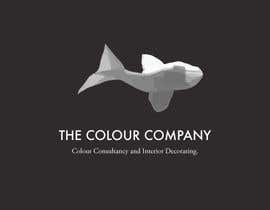
Logo Design for The Colour Company - Colour Consultancy and Interior Decorating.
- Status: Closed
- Prêmio: $290
- Inscrições Recebidas: 78
- Vencedor: jennytattoobardc

Síntese do concurso
Interior Decorating. Colour consultancy - Interiors and exteriors.
Product selections - Lighting, fabrics, furniture, flooring, fixtures and fittings.
Preparing houses for sale - Interior Styling
My website will be the base for my portfolio of work.
Habilidades Recomendadas
Feedback do Empregador
“@jennytattoobardc won the contest on 23 February 2013”
![]() om2017, Australia.
om2017, Australia.
Painel de Comentários
-

ProDarell
- 11 anos atrás
- 11 anos atrás
-

ImArtist
- 11 anos atrás
Hello, Please check my entries and private message about the concept. Thanks a ton.
- 11 anos atrás
-

KUMUD
- 11 anos atrás
#195
- 11 anos atrás
-

kalart
- 11 anos atrás
#307 Purchased here: http://www.clipartof.com/interior_wall_decor/details/Abstract-Letter-C-Icons-With-Shadows-5-Poster-Art-Print-1112264
- 11 anos atrás
-

mega619
- 11 anos atrás
PLEASE TAKE A PEEK ON #369
- 11 anos atrás
-
ProDarell
- 11 anos atrás
#351 Any feedback is appreciated. Thanks
- 11 anos atrás
-
ProDarell
- 11 anos atrás
#350 Any feedback is appreciated. Thanks
- 11 anos atrás
-
ProDarell
- 11 anos atrás
#342 Any feedback is appreciated. Thanks.
- 11 anos atrás
-
logonero
- 11 anos atrás
To the contest holder and fellow entrants. As a relatively new player in this freelance game, I am disapointed to see the type of underhanded tactics that happen to disqualify original designs. Unbelievably `May Design' has found a logo with a shape exactly like my design (but obviously quickly and badly coloured) and used it to make the accusation of plagarism. This file has no ownership info and a creation date of 27 January 2013 10:49:20 AM, after I submitted my design.
I don't mind if this design doesn't end up winning. But I will defend its originality!- 11 anos atrás
-
ImArtist
- 11 anos atrás
Please check #333 #334 and #335 with private message. thanks
- 11 anos atrás
-
habitualcreative
- 11 anos atrás
kindly rate my different and unique idea #294
- 11 anos atrás
-

coreYes
- 11 anos atrás
SO sad to see contests like this! I wonder how many sealed contests ends like this, with copied designs...? No serious designer would enter a contest where copied designs are rated five stars and labeled 'creative work'...
- 11 anos atrás
-

Proprietário do Concurso - 11 anos atrás
Entry #167 -like the 2 birds style but maybe dark electric purple style and a jade green for the birds, fonts needs to be more changed to similar style to #166 font, also like to still have a dark back ground but more along the lines of #166 grey not black or deep color. Would also need to see 2 variants now for all final entries one being on a white background and one on a dark greyish background.Entry #166 , really like the creative approach of the fish which looks great, need to build in some color into the fish eg where dark part of fish near the eye needs a bit of color added not defined just a splash also maybe a splash of color on the tail in the middle where you have the darker shades at the moment. Font & background colour is really great in #166 and is the best style of font. Need to see this also with a white back ground variation as well as the darker background versions.BE Creative do not want to "C" any more "C" logo styles which will be rejected.
- 11 anos atrás
Ver mais 4 mensagens
-

Vixxxen
- 11 anos atrás
Hello
I do not mean any disrespect to you as a contect holder. I just have to say that may designers have taken the time to design your logo. You say "look at #166 and get creative!!!!!" Well that person is far from original. They just took an image off the internet and changed it to grey scale and you say that is Original.
Here is the link to where that image is:
http://www.papercraftcentral.net/2011/12/animal-origami-koi/
It is at the bottom of the page.
I hope that you give designers a chance who actually take the time to design something for you.
Thank you
.- 11 anos atrás
-

jennytattoobardc
- 11 anos atrás
http://www.vectorstock.com/royalty-free-vector/origami-birds-vector-381973
- 11 anos atrás
-
Proprietário do Concurso - 11 anos atrás
AGAIN..PLEASE LOOK AND READ THROUGH MY PREVIOUS MESSAGE ON THE BOARD. Do not send anymore logos through that use capital C. look at #166 and get creative!!!!! thanks
- 11 anos atrás
-

badcom
- 11 anos atrás
Any thoughts on #264 , #265 , feedback appreciated, Question about any particular font style you would like?
- 11 anos atrás
-

BayuSyafresal
- 11 anos atrás
please check #261
- 11 anos atrás
-

designersyeda
- 11 anos atrás
Please Check #253 & give your valuable feedback. Thanks
- 11 anos atrás
-

yeaho00
- 11 anos atrás
#252 Please Check
- 11 anos atrás
-

premgd1
- 11 anos atrás
validate #247 and #248
- 11 anos atrás
-

reynoldsalceda
- 11 anos atrás
Please check #227. Thanks
- 11 anos atrás
-
Proprietário do Concurso - 11 anos atrás
Thankyou again for all your entries. I have rejected quite a number again that are not suited to my requirements.
Again, i prefer a dark background. The logo will also be setting the tone for my website, so it really needs to be quite nifty and creative.
Number 145 has the perfect logo and font.
My favourites at present are numbers 161, 166,167, and 182.
I love the Fish, its original and different....very good. I also think number 161 is very creative, simple and very classy.
I also really like 182...i love the use of the "Cranes" for the Capital C
PLEASE GUYS, SEND ME SOMETHING ORIGINAL.
THANKS. :)
I only require real ORIGINAL DESIGNS...please give me something different!!- 11 anos atrás
-

dhanashri2104
- 11 anos atrás
Please check #222 and #223
- 11 anos atrás
-
kalart
- 11 anos atrás
#48 #51 Origami birds purchased here: http://www.vectorstock.com/royalty-free-vector/origami-birds-vector-381973
- 11 anos atrás
-
kalart
- 11 anos atrás
#195 #196 Not an original design: http://commons.wikimedia.org/wiki/File:C-TIDES_LOGO.png
- 11 anos atrás
-
habitualcreative
- 11 anos atrás
please feedback #208 #209 #210 #211 #212
thanks- 11 anos atrás
-
Shiriharusha
- 11 anos atrás
Hi, please check #206 and give me the feed back. Thank you.
- 11 anos atrás
-
KUMUD
- 11 anos atrás
#195 #196 Please check
- 11 anos atrás
-
KUMUD
- 11 anos atrás
#190 #189 Please check
- 11 anos atrás
-
KUMUD
- 11 anos atrás
#186
- 11 anos atrás
-
Proprietário do Concurso - 11 anos atrás
To clarify on this board is easier. Thankyou to everyone again for adding so many designs. Thanks :)
I love the simplicity of the wording of # 145 and #70. Simple and classy.
I also love the wording and font on # 107.
I stated some days ago that i loved the "Cranes" on Freelancers webpage. Since then i have had two entries # 48, 49 ,50 ,51 and #107. I really like both.
I also love the Capital C from # 107 made out of Cranes.
It is also quite obviously that there has been many rejected that are on a white background...dont like!!
I really like # 109, but im not sure about the white background or the use of the colours of the Capital C
Cheers guys.- 11 anos atrás
-
Vixxxen
- 11 anos atrás
Are there any changes I can make to #48 #51 to make them better?
I can change the font on the text or arrange the birds better?
Any input would be great!
Thanx for the 3 stars!
:)- 11 anos atrás
-
kalart
- 11 anos atrás
@om2017 Thank you for your rating and comments. Please click on my username to view my private messages.
- 11 anos atrás
-

agravatmanish
- 11 anos atrás
Hi,
please check #177, #178, #179,
Thank you.- 11 anos atrás
-
Shiriharusha
- 11 anos atrás
Hi, please check #173. Your feedback will be useful to me. Thank you.
- 11 anos atrás
-
premgd1
- 11 anos atrás
Please rate #167 . Thanks
- 11 anos atrás
-
logonero
- 11 anos atrás
Hello om217,
please find design #161 - adjusted as per your request.- 11 anos atrás
-
Proprietário do Concurso - 11 anos atrás
THANKYOU to everyone so far for all your designs, their great to look through. :)
- 11 anos atrás
-

Brandingdon
- 11 anos atrás
# 152, you can see lighting, space, color "without a rainbow" and texture. Looks contemporary. I like the short tags (slogans), easy to remember and go beyond the literal service.
- 11 anos atrás
-

abd786vw
- 11 anos atrás
Hi. plz check # 150
- 11 anos atrás
-
KUMUD
- 11 anos atrás
#149 #149
- 11 anos atrás
-
KUMUD
- 11 anos atrás
#146
- 11 anos atrás
-

logoCorei7
- 11 anos atrás
Please check #138 he is copy this logo from in this link http://99designs.com/logo-design/store/40200
I think all the designer need to violate this person now!- 11 anos atrás
-
Proprietário do Concurso - 11 anos atrás
Can any of you guys see the Cranes on the Freelancers home page????
I like the idea of a black background. :)- 11 anos atrás
-
logoCorei7
- 11 anos atrás
you need to seal this contest! thanks copier worker don't understand what your are like. So you are get some good concept! copier guy follow to your rating and also follow good designer logo make copy.
- 11 anos atrás
-
coreYes
- 11 anos atrás
http://www.freevectorsdaily.com/orgami-birds-vector/
I wouldn't seal it. Copycats love sealed contests. Most of the time CH realize too late he paid for a copy. Sorry to say that!- 11 anos atrás
-
logoCorei7
- 11 anos atrás
also copy #127
- 11 anos atrás
Como começar com concursos
-

Publique seu Concurso Rápido e fácil
-

Obtenha Toneladas de Inscrições De todo o mundo
-

Premie a melhor inscrição Baixe os arquivos, é fácil!