Graphic Design for Birthday Party Invitation
- Status: Closed
- Prêmio: $100
- Inscrições Recebidas: 2
- Vencedor: smhdzines

Síntese do concurso
A 30th Birthday Party
Habilidades Recomendadas
Feedback do Empregador
“I had a great experience with Sarah, and I really appreciate the work she created for me. I would definitely use her design skills again.”
![]() candicesmee, Australia.
candicesmee, Australia.
Painel de Comentários
-

smhdzines
- 12 anos atrás
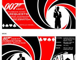
Hi Candice, I hope I have created something that you like :-) I wanted it to be simple and effective and create that sleek feeling that we all associate with a James Bond movie/theme. These can have subtle changes made if required. Good Luck with your choice! Cheers, Sarah
- 12 anos atrás
-

hardbarrel
- 12 anos atrás
Hello, please check my artwork #49... and send me feed back. Thanks...
- 12 anos atrás
-

gouravswagata
- 12 anos atrás
do check #48...took us a while to create this. hope you like it.thank u.
- 12 anos atrás
-

aliartdesign
- 12 anos atrás
hi, can you please check #47 , thanks
- 12 anos atrás
-
gouravswagata
- 12 anos atrás
thank you for your rating..but i wanna go on top and do the design for you. so here is #46...a more graphical yet sleek outlook on your theme. plz rate. awaiting your feedback.
- 12 anos atrás
-
Proprietário do Concurso - 12 anos atrás
Hi everyone,
Thank you so much for your entries. I have rated the new additions, and I'm beginning to have a few favourites, but I haven't made up my mind yet.
Now, that I have seen some attempts, I can give some more guidance for what I am after.
My thoughts, based on the entries so far:
No photos of Daniel Craig - I like some of the ambiguous silhouette shots, but I'm not keen on the actual photos of Daniel Craig.
I really like the invites that have successfully combined the James Bond/Casino theme.
I think that the more formal fonts look much better with the theme, then the swirly, almost handwritten fonts.
I don't like clutter, the more sleek and sophisticated the invitation, the better.
I hope that advice helps.
Keep adding new entries, and good luck!- 12 anos atrás
Ver mais 1 mensagem
-
gouravswagata
- 12 anos atrás
do see #44...hope you like it...its shaken and not stirred
- 12 anos atrás
-

vishmith
- 12 anos atrás
nos. 41 and 42 inside and outside. Fold line is in the middle of the person. So you would see only half of the woman. pls rate.:)
- 12 anos atrás
-

redeyeproduction
- 12 anos atrás
hi dear,
please feedback #30 #31
Thanks- 12 anos atrás
-

xcerlow
- 12 anos atrás
#27
- 12 anos atrás
-
xcerlow
- 12 anos atrás
#26
- 12 anos atrás
-
Proprietário do Concurso - 12 anos atrás
Thank you for all the entries so far. I have rated them according to my preference. However, I still haven't seen anything that is quite perfect, yet.
By Lorem Ipsum, I meant for people to use dummy text to fill in the space, not the font.- 12 anos atrás
-

BevUK
- 12 anos atrás
please check out #19 thank you
- 12 anos atrás
-
BevUK
- 12 anos atrás
can i just conferm that you want the font used is Loremipsum ,it's just that no one has used it
- 12 anos atrás
-

dyeth
- 12 anos atrás
it is not a font that the CH meant :)
- 12 anos atrás
-

armanlim
- 12 anos atrás
Please rate and comment on #6 thanks.
- 12 anos atrás
-
aliartdesign
- 12 anos atrás
sorry about #3 it was wrong file
- 12 anos atrás
-
aliartdesign
- 12 anos atrás
hi, can you please check #4 , thank you
- 12 anos atrás
-
BevUK
- 12 anos atrás
please check out #2
- 12 anos atrás
-

Sivan2864
- 12 anos atrás
hi, Im jst uploading my first post plz rate it as possible #1
- 12 anos atrás
-
BevUK
- 12 anos atrás
i need to ask you something in private can you tell me how i can send you a private message please
- 12 anos atrás
Como começar com concursos
-

Publique seu Concurso Rápido e fácil
-

Obtenha Toneladas de Inscrições De todo o mundo
-

Premie a melhor inscrição Baixe os arquivos, é fácil!