Design a Logo/Graphic for Kids' Program

  • Status: Closed
  • Prêmio: $50
  • Inscrições Recebidas: 31
  • Vencedor: stanbaker

Síntese do concurso

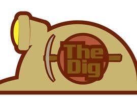
We're re-branding a kids' program, and need a logo/graphic to represent the new name. It's called The Dig, and the graphic should include this text. The program is for boys at our church in grades 1-6. The new name is intended to communicate themes of searching/mining, hard work, masculinity, and teamwork. We're looking for something that graphically communicates as many of these ideas as possible. The graphic should be contemporary and age-appropriate. We'd prefer a fairly simple color scheme (given the name, earth tones would be appropriate, though other options will be considered as well).

This project is on the fast track, so preference will be given to projects submitted early!

Habilidades Recomendadas

Feedback do Empregador

“Thanks stanbaker! Clear communication & great end product.”

Foto do perfil solideo, United States.

Painel de Comentários

  • stanbaker
    stanbaker
    • 10 anos atrás

    Please review my submission number 23. Thank you.

    • 10 anos atrás
    1. solideo
      Proprietário do Concurso
      • 10 anos atrás

      I prefer the angular look of the light in 38 to the rounded look in 37, though I think I like the yellow light better. If we made it a little larger, and maybe kind of triangular in shape, that might clarify that it's a light. With the smaller lights, I keep seeing a a fat animal with a small head. Thoughts?

      • 10 anos atrás
    2. stanbaker
      stanbaker
      • 10 anos atrás

      Look at number 40. Thanks.

      • 10 anos atrás
  • solideo
    Proprietário do Concurso
    • 10 anos atrás

    Here's a sketch an associate came up with that captures much of what we're after in terms of theme:

    http://www.solideosolutions.com/thedig/thedig.jpg

    As we've discussed it, we've decided that if a character is included it should be less Bob-the-builder than what's shown here, and more of a stylized adult miner. If that combination could be rendered in a flat style similar to #6 -8, we'd be getting really close.

    • 10 anos atrás
    1. solideo
      Proprietário do Concurso
      • 10 anos atrás

      Maybe I should clarify what we're looking for if a character is included. We'd like something pretty masculine... representative of what a 4th grade boy would want to look like when he grows up (assuming he grows up to dig for things). Cartoon style is still ok, but maybe something more beefy and angular.

      • 10 anos atrás
    2. stanbaker
      stanbaker
      • 10 anos atrás

      Can do. I'm working on it.

      • 10 anos atrás
  • samazran
    samazran
    • 10 anos atrás

    Thank you "stanbaker" you like my entry #14 .

    • 10 anos atrás
  • andrefantini
    andrefantini
    • 10 anos atrás

    #33

    • 10 anos atrás
  • RohithMadhavan
    RohithMadhavan
    • 10 anos atrás

    Feedback on #28 please!

    • 10 anos atrás
  • solideo
    Proprietário do Concurso
    • 10 anos atrás

    Hey all, thanks so much for your submissions so far! As you can see from the ratings, the more recent submissions are getting closer to what we're after. Some of the 3-star ratings look really nice in terms of design... I really like the simplicity and the color schemes; What I'm looking for is probably something a little more manly and grungy than #6 -9. At the same time, we're looking for something kid friendly - But NOT Comic Sans kind of kid-friendly.

    Added graphical creativity would be a plus, especially if the design is kept simple. Integration of a hard hat or pickax are options. Keep up the good work!

    • 10 anos atrás
    1. suneelkaith
      suneelkaith
      • 10 anos atrás

      Please check Design #27

      • 10 anos atrás
  • solideo
    Proprietário do Concurso
    • 10 anos atrás

    Hi samazran, I can really see the appeal in #25 - good colors, simple and creative. I think that for the current application, we're looking for something that carries more of a masculine theme.

    • 10 anos atrás
  • samazran
    samazran
    • 10 anos atrás

    Feedback please...

    • 10 anos atrás
  • solideo
    Proprietário do Concurso
    • 10 anos atrás

    stanbaker, I really like what you've come up with in #20 .

    • 10 anos atrás
  • stanbaker
    stanbaker
    • 10 anos atrás

    Please review my submission number 20. Thank you.

    • 10 anos atrás
  • stanbaker
    stanbaker
    • 10 anos atrás

    I am deleting number 13 because it is not displaying correctly. Sorry. I will be back with another submission.

    • 10 anos atrás
  • stanbaker
    stanbaker
    • 10 anos atrás

    Please review my submission number 13. Thank you.

    • 10 anos atrás
  • ummekulsumhk
    ummekulsumhk
    • 10 anos atrás

    Hi, please do give your feedback so that i can make required changes as per your opinion.

    • 10 anos atrás

Mostrar mais comentários

Como começar com concursos

  • Publique seu concurso

    Publique seu Concurso Rápido e fácil

  • Receba muitas inscrições

    Obtenha Toneladas de Inscrições De todo o mundo

  • Premie a melhor inscrição

    Premie a melhor inscrição Baixe os arquivos, é fácil!

Poste um Concurso ou Junte-se a nós Hoje!