Design a Logo for a new product line
- Status: Closed
- Prêmio: $100
- Inscrições Recebidas: 169
- Vencedor: renderstudio

Síntese do concurso
!!!!!!Read the added notes to the end that were taking from the messages!!!!!
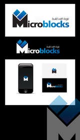
I am developing a range of products in the form of modules.
The name i use is "MicroBlocks" with "Build with logic" as a tagline.
These module are not easy to put in a category because there will be:
electronic modules: microcontrollers, sensors, motor control etc.
mechanical modules: gearboxes, servos, pumps, linear slides, ways, etc
electrical modules: dimmers, switches, lights, etc
software: eCommerce, Forum, CMS, etc
building: ICF forms, hollow core, fasteners etc
etc...
Logo in full color that degrades well to two colors. Transparent background. Background will be light colored like white/very light grey/aluminum.
Full color will be used on digital media, 2 color on the product with pad printing.
Keep in mind the tolerances needed for pad printing. Pad printing must be possible on black product.
The format will have to be vector based as it will be used in many different sizes.
Logo will be used on website, twitter, facebook, etc.
A "logo by" with your name and URL will be included on every page footer.
If you have website building skill you will also be considered for that.
Added notes! (Taken from the messages)
Don't forget the tagline!
I think i like the whole word microblocks (caps or lowercase or mix is ok) better then only using the MB in the logo.
The letters MB have to many associations, so i want to avoid that.
Remember the requirement is that it can be printer with a pad printer in 2 colors on light and dark material.
I'll have to refine my requirements.
I don't want a very prominent "MB" as part of the logo. It can be if it is not obvious. Few famous companies are associated with MB.
Second the abstract part of the logo should be recognizable and standout. Think of the logo from as an example Motorola. The complete logo is the circle with the M inside followed by the word Motorola. It can be used together or the circle with the M can be used alone. As i will have parts that are small using only that abstract part is important. And to make it clear i do not want that part of the logo to be a very recognizable MB. I also come to the conclusion that i prefer a logo that is not that high it like it to be at least 4 times as wide as it is high.
Thank you for you submissions sofar, i am impressed with the speed and variety, although i would like to see some other colors then blue and black.
Habilidades Recomendadas
Feedback do Empregador
“Was a great experience. Designed a logo according to specifications and was very quick when modifications were asked. Previews were made in all styles asked to get a good impression and the final delivered files are of very good quality. Very satisfied!”
![]() tzadvantage, Thailand.
tzadvantage, Thailand.
Painel de Comentários
-
Proprietário do Concurso - 10 anos atrás
I would like to sincerely thank all people who contributed.
There were some great quality logos submitted.
Alas there can be only one winner.
Soon i will post a contest for designing a website, so stay tuned.- 10 anos atrás
-

RONo0dle
- 10 anos atrás
heh! this contest was a waste of time... anyway congrats to the winner.
- 10 anos atrás
-
Proprietário do Concurso - 10 anos atrás
Why?
It has been a good contest for me because i got what i wanted. The winner also.
With logos it is all about taste. I really liked some of your designs, but not enough to award the contest.
I soon will make a website design contest, i hope you will consider it.- 10 anos atrás
-

airijusksevickas
- 10 anos atrás
Hello here is another version of microblocks logo. Can be done in any color or any combination. Files are .PNG [3162x3551] .AI [vector can be in any size] .JPEG .PSD .EPS .PDF. 2COLORS #212
- 10 anos atrás
-

DanielAlbino
- 10 anos atrás
sir please send some feedback #182 #183
- 10 anos atrás
-
Herry1an
- 10 anos atrás
hi CH .. please check #177 .. my fifth entry for your logo .. thanks :)
- 10 anos atrás
-
Proprietário do Concurso - 10 anos atrás
I have added the messages i wrote here to the brief as many designs are made without taking it into consideration.
My requirements are forced on my by the equipment i have.
A pad printer works with ink, it is nothing more then an accurate rubber stamp.
The logo can use any color as long as it degrades very well into 2 colors that can be used on a pad printer. That means a loss of gradients and mixing of colors. I need to be able to print on a light or a dark material so the logo that is made with more color gradients need to degrade well to basic colors.
Thank you so far for the submissions. A lot of good designs and i will within 2-3 days narrow it down to only a few that fit my requirements and taste the best.- 10 anos atrás
-
Proprietário do Concurso - 10 anos atrás
Apologies to others that i rejected, this is my first on freelancer, so i am not 100% familiar with how points are distributed.
I will undo the rejects and make them 1 star.
Unfortunately for RONoOdle but i can not undo ones you redraw.- 10 anos atrás
-
RONo0dle
- 10 anos atrás
It's ok... the damage was done. i lost twice the amount of XP when i withdrawn my designs... and no offense but i don think that nr #10 is what quality is about...but who am i to judge ... that was just personal opinion.
- 10 anos atrás
-

cathy90
- 10 anos atrás
I wish u considered once mine too :(
- 10 anos atrás
-
RONo0dle
- 10 anos atrás
Hi, i have withdrawn my entry's since you love to reject designs. What you dont know is that we lose experience points when you do that and it will make it more difficult for you to find a design that you my like since you rather reject reject them in stead of rating them with one star. i wish you all the best in finding a design that you my like. this contest ends here for me. Bye!
- 10 anos atrás
-
Proprietário do Concurso - 10 anos atrás
I reject them because they are not following the requirements.
If you send 10 that are almost the same i reject most of them and rate the best of those.
I think quality is better then quantity and if experience points are givin for quantity then that is in my opinion wrong.- 10 anos atrás
-
davidliyung
- 10 anos atrás
Please check #129 , 130 and 131 and feedback. Thanks!
- 10 anos atrás
-
RONo0dle
- 10 anos atrás
Hi, please check #124 Thanks
- 10 anos atrás
-
Proprietário do Concurso - 10 anos atrás
I'll have to refine my requirements.
I don't want a very prominent "MB" as part of the logo. It can be if it is not obvious. Few famous companies are associated with MB.
Second the abstract part of the logo should be recognizable and standout. Think of the logo from as an example Motorola. The complete logo is the circle with the M inside followed by the word Motorola. It can be used together or the circle with the M can be used alone. As i will have parts that are small using only that abstract part is important. And to make it clear i do not want that part of the logo to be a very recognizable MB. I also come to the conclusion that i prefer a logo that is not that high it like it to be at least 4 times as wide as it is high.
Thank you for you submissions sofar, i am impressed with the speed and variety, although i would like to see some other colors then blue and black.- 10 anos atrás
-

niravashara
- 10 anos atrás
Check #118
- 10 anos atrás
-
airijusksevickas
- 10 anos atrás
Please check and rate. #114 Can be changeable.
- 10 anos atrás
-
Proprietário do Concurso - 10 anos atrás
Remember the requirement is that it can be printer with a pad printer in 2 colors on light and dark material.
- 10 anos atrás
-
davidliyung
- 10 anos atrás
Please check #73 ,74 and 81. Thanks!
- 10 anos atrás
-

lucianacabane
- 10 anos atrás
feedback please!
- 10 anos atrás
-

ITSMERUSHME
- 10 anos atrás
Feedback for #52 please. This is just an idea for blocks with logic, if you like the concept, lot of things can be experimented. thank you !
- 10 anos atrás
-
Herry1an
- 10 anos atrás
hi CH .. your feedback for #47 and #48, please .. and if there are any revisions needed on the design, I'd like to know .. please do not hesitate to tell me via private message so I can get to you ASAP .. thanks :)
- 10 anos atrás
-

helenasdesign
- 10 anos atrás
Let me know what you think of #46 . Best Regards!
- 10 anos atrás
-
cathy90
- 10 anos atrás
#33 PLease feedback!
- 10 anos atrás
-

ferasyamani
- 10 anos atrás
hello... could please check entry # 21 & 26 , i need your feed back :)
- 10 anos atrás
-
Proprietário do Concurso - 10 anos atrás
Both entries that were an exact copy have been reported.
Please use your own imagination.- 10 anos atrás
-

renderstudio
- 10 anos atrás
#4 copy:http://www.grafotecnica.it/servizi/
- 10 anos atrás
-
Proprietário do Concurso - 10 anos atrás
Indeed, and it is copyrighted too. So i have to dismiss those.
The idea of using a abstract logo is however valid.- 10 anos atrás
-
renderstudio
- 10 anos atrás
#5 copy:http://www.kfar-saba.muni.il/?CategoryID=2178
- 10 anos atrás
-
Proprietário do Concurso - 10 anos atrás
I don't mind if it comes from some stock material. As long as it fits the bill and does not conflict with copyright.
- 10 anos atrás
-
Proprietário do Concurso - 10 anos atrás
I think i like the whole word microblocks (caps or lowercase or mix is ok) better then only using the MB in the logo.
The letters MB have to many associations, so i want to avoid that.- 10 anos atrás
-
Proprietário do Concurso - 10 anos atrás
Don't forget the tagline!
- 10 anos atrás
Como começar com concursos
-

Publique seu Concurso Rápido e fácil
-

Obtenha Toneladas de Inscrições De todo o mundo
-

Premie a melhor inscrição Baixe os arquivos, é fácil!