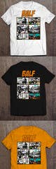
Freelancer: qwasoff
Compartilhar:
Denunciar Inscrição

T-Shirt BALF

I've added a new frame with the man in the office who holds his head. I add color to the last frame. I changed the position of the logo. But I do not like the idea of replacing the color in the effects, clouds (poof, tick-tock ..). It goes well with orange - blue, dark blue, purple, and blue as the sky. Thank you.

Inscrição nº 18 do Concurso para                                                 Design a T-Shirt BALF
Inscrição nº18

Painel de Comentários

  • balfliga
    Proprietário do Concurso
    • 7 anos atrás

    This is awesome. I agree with you that some colors stand out from others, perhaps some such as green and yellow stand out too much from others. Or maybe they need to a little darker, or may your suggestion of colors, but the last picture is great. So only the colors that are too garish, fluorescent, to be replaced by a little darker. In the first frame to be some stronger color, attention is needed to be directed to the first frame and then to others. Send that and i will select you as a winner.

    • 7 anos atrás
    1. qwasoff
      qwasoff
      • 7 anos atrás

      check #19

      • 7 anos atrás
  • qwasoff
    qwasoff
    • 7 anos atrás

    the colors in the effects (clouds) for an example of how they are combined with orange.

    • 7 anos atrás