
andryancaw
Indonesia

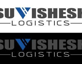
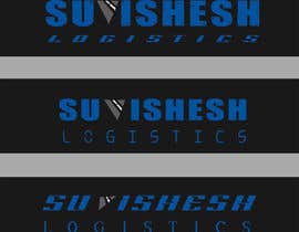
I need my logo corrected, below are the requirements
READ CAREFULLY
1. Make it symmetrical, specially the V part in the middle, it represents a road. The marking that are supposed to be road surface markings are not aligned. Resize and reshape if need be.
2. Use a more powerful and compact font (For eg. Impact) for the whole logo. You can make the 'V' less broader if need be.
3. Need the V part in the middle in blueish shade (eg. 0051a0) and rest in dark grey. Also, if possible need vice versa colors too (i.e. V in dark grey and rest in blue)
4. Whole logo should present like a rectangle banner. ('Suvishesh' and 'Logistics' start and end points should vertically align). However, 'Logistics' font should be visibly smaller to that of 'Suvishesh', so play around with different font or spacing or bold etc.
If possible, prepare 3-4 samples, thanks :)
Will need PNG, JPD and AI file
“nice work done”
![]() sugandhgulati, India.
sugandhgulati, India.


Publique seu Concurso Rápido e fácil

Obtenha Toneladas de Inscrições De todo o mundo

Premie a melhor inscrição Baixe os arquivos, é fácil!